

Microsoft 365’s PowerApps can be created based on a fixed layout for one of a portrait mobile device (i.e. phone) or landscape device (i.e. desktop or tablet) only. Given that most users will adopt a combination of devices when accessing apps, this either means you have to develop your PowerApps app twice or you have to try to get something not designed to have a responsive layout to be responsive.
First and foremost, this is not a perfect solution to responsive layouts and I’ve found it can be cumbersome to implement and maintain. Especially since an accidental mouse movement when clicking a control on the editor can undo all the responsive layout ‘code’ you’ve implemented on that control.
But, if you want a solution where you can develop a single PowerApps app to target multiple device sizes and orientations then this is a working approach.
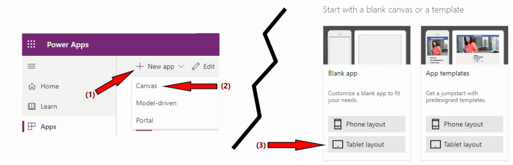
Let’s get started by producing a simple blank app by going to the PowerApps web editor.
We’re starting with a blank app for simplicity, but you could start by creating an app from a data source (such as a SharePoint site) instead if you preferred. It’ll be much more difficult to follow the instructions below if you don’t start with a blank app though!
Just make sure you choose the Tablet layout – it is typically much easier to do a desktop layout and have it wrap on smaller screens than to do a portrait layout and try to get it to expand onto larger ones!
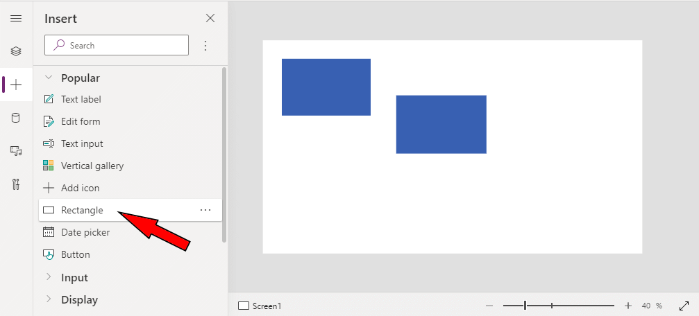
You may get asked if you want to add a form or gallery to your new app when the editor finishes initialising, if you went for the blank app template. Just choose the Form option for now (as we’ll be deleting it again immediately afterwards).
You should now have a form on Screen1. Delete the form so screen1 is empty again. Then add two rectangles from the toolbox.
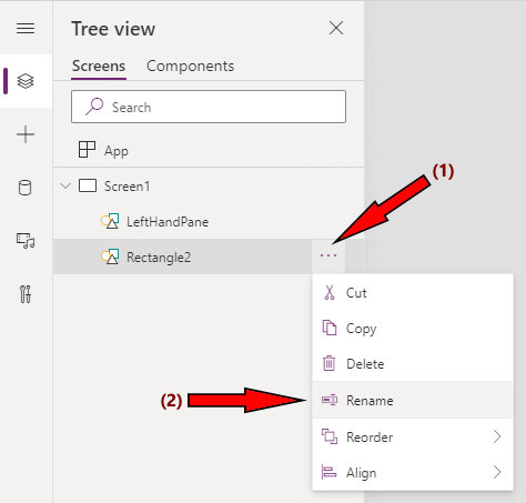
Rename the rectangles ‘LeftHandPane’ and ‘RightHandPane’.
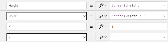
Now we want to align and size the rectangles on the screen. We do this by selecting the appropriate element properties and updating them to use values relative to their parent (Screen1).
For the ‘LeftHandPane’ rectangle, we’ll update it like this:
Now select the ‘RightHandPane’ rectangle, and we can update the settings for that:
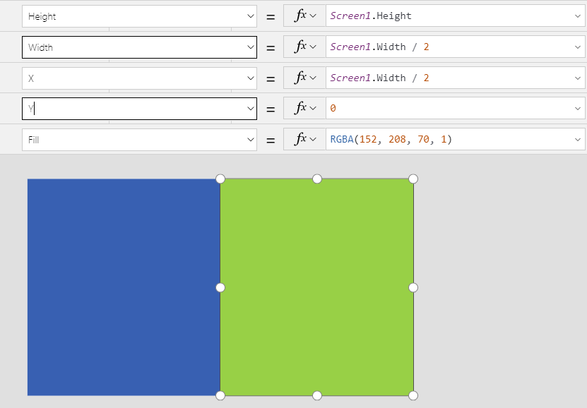
If everything has gone to plan you should end up with a screen layout that has a left-hand-side (LHS) blue pane and a right-hand-side (RHS) green pane as shown in the screen-shot above. At the moment this screen isn’t responsive, but before we do that let’s add screen width details to the LHS pane and screen height details to the RHS pane.
We’ll also make the size and positioning of the content we’re adding to the panes relative to them (in reality they aren’t actually inserted into the panes, just drawn over them, but the principle is the same). Making the ‘content’ of the pane positioned relative to the pane itself is important as it makes responsive layout much more straightforward to achieve.
First, drag a text label element onto the screen, rename it to ViewportWidthLabel, and edit its properties so that it displays the screen width on the LHS pane as follows:
- Align = Align.Center
- Color = RGBA(255, 255, 255, 1)
- Text = “Viewport Width: ” & Screen1.Width & “px”
- Width = LeftHandPane.Width
- X = 0
- Y = (LeftHandPane.Height – ViewportWidthLabel.Height) / 2
Now, let’s drag another text label onto the screen that will display the screen height on the RHS pane. Rename it to ViewportHeightLabel, and update its properties as follows:
- Align = Align.Center
- Text = “Viewport Height: ” & Screen1.Height & “px”
- Width = RightHandPane.Height
- X = RightHandPane.X
- Y = RightHandPane.Y + ((RightHandPane.Height – ViewportHeightLabel.Height) / 2)
We’ve now got some content on each of the panes, and the content is aligned and sized based on those panes instead of being explicitly positioned. We’re ready to make our layout more responsive to screen size/orientation changes.
IMPORTANT: From this point on we need to take great care when selecting and editing controls because if we move them even slightly when clicking on them with the mouse in the editor area then our relative sizing or positioning property values can be discarded and replaced by static values based on the current position of the control in focus.
To reduce the opportunity of cancelling out size/position calculations as much as possible we can try to only select controls from the ‘Tree view’ pane of the editor toolbox instead of selecting them on the graphical editor itself.
In this example, we’re going to update the app so that the panes will become stacked on top of each other if the screen size is 800 pixels wide or less. Since our LHS and RHS pane ‘content’ is linked to the position of those panes, this is fairly simple to achieve.
Change the properties of the LHS pane as follows:
- Height = If(Screen1.Width > 800, Screen1.Height, Screen1.Height / 2)
- Width = If(Screen1.Width > 800, Screen1.Width / 2, Screen1.Width)
Change the properties of the RHS pane as follows:
- Height = If(Screen1.Width > 800, Screen1.Height, Screen1.Height / 2)
- Width = If(Screen1.Width > 800, Screen1.Width / 2, Screen1.Width)
- X = If(Screen1.Width > 800, Screen1.Width / 2, 0)
- Y = If(Screen1.Width > 800, 0, Screen1.Height / 2)
Save your app.
f you run the app right now, then you’ll probably be disappointed to note that the responsive layout doesn’t appear to be working at all and you’d be wondering why you wasted your time on this article. Well, fear not… there’s one last thing we haven’t done yet and that is to disable ‘Scale to Fit’ and other options that interfere with the work we’ve done to make our PowerApps app more responsive to device size.
Go to the app’s settings via the editor’s File menu, and then turn off the ‘Scale to fit’ and ‘Lock orientation’ settings in the ‘Screen size + orientation’ category. Save and re-publish the app, and it should then work!
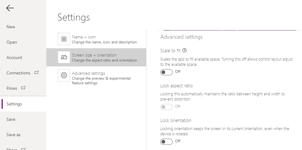
Footnote: do not run the finished app in the PowerApps web editor’s ‘preview’ mode because, annoyingly, it probably won’t work. My experience has been that the preview ignores the above settings, so you need to launch the app normally (i.e. not from within the editor) to view how it will work in reality.