

This article aims to introduce using Bootstrap in scenarios where an IDE (like Visual Studio) hasn’t set up a complete starting point for you, or where you want to control exactly what your page layout will be. This is as much my own aid memoir as it is an article in its own right to help others.
NOTE (1): This article was written for Bootstrap 3. Newer versions of the API may behave slightly differently.
NOTE (2): For information on the proper way to override Bootstrap styles see this article instead.
To make navigation easier, this article is broken out into navigable sections for quick reference.
- Getting Started
- Navigation Menus
- Visibility Options
- Panels
- Buttons, Badges, Labels and Alerts
- Miscellaneous Other CSS Elements
- Modal Popups
- Tabbed Layouts
- Scroll-Spy
Getting Started
Getting Started – Mobile-First Rendering
Latest versions of Bootstrap are developed for mobile-first rendering, with specific overrides for larger devices. Bootstrap specifies several relative screen widths as a basis for viewport sizing.
- Default – less than 768px.
- Small – devices from 768px wide, up to 991px.
- Medium – devices from 992px wide, up to 1199px.
- Large – devices from 1200px upwards.
You can use defined relative screen size media queries in CSS to modify the default Bootstrap styles. These are: @screen-sm-min, @screen-sm-max, @screen-md-min, @screen-md-max, @screen-lg-min, @screen-lg-max. For example:
@media (min-width: @screen-md-min) {
    padding: 5px;
}

@media (min-width: @screen-lg-min) {
    padding: 20px;
}Code language: CSS (css)
Aside: As a wider general rule, most Bootstrap CSS classes support a standard set of relative sizes (xs, sm, md, lg). For example btn-sm, btn-lg, etc.
For mobile-first rendering with touch-zoom support, add the following to the head region of your HTML file:
<meta name="viewport" content="width=device-width, initial-scale=1">Code language: HTML, XML (xml)Or, to stop zooming capabilities on mobile devices you can use this instead:
<meta name="viewport" content="width=device-width, initial-scale=1, maximum-scale=1, user-scalable=no">Code language: HTML, XML (xml)Getting Started – Containers
Everything should be in a container! The container class specifies the main layout criterion for the web page, and can be defined as a fixed width layout or a fluid container that stretches to fill the viewport. Containers shouldn’t be nested.
<div class="container">
    <!-- some content -->
</div>

OR

<div class="container-fluid">
    <!-- some content -->
</div>Code language: HTML, XML (xml)
Getting Started – The Grid System
The basis of Bootstrap’s layout is a grid system, that sits inside one of the container types. The grid columns are defined by a set of CSS classes in 4 relative sizes: col-xs-, col-sm-, col-md- and col-lg-. These relative sizes (extra small, small, medium and large), represent conditional layout based on anticipated device viewport width. Only the XS set of classes are horizontal at all times. The others will overflow onto multiple lines (stack up) where necessary.
Layout should be arranged as rows and columns. Each row should have columns totalling 12 with spanned columns defined by their classes. For example:
<div class="container-fluid">
    <div class="row">
        <div class="col-md-4">
            <!-- some content in a 1/3 width column -->
        </div>
        <div class="col-md-8">
        <!-- some content in a 2/3 width column -->
        </div>
    </div>
</div>Code language: HTML, XML (xml)
You can also set multiple options for different display sizes to help to provide an improved layout experience across devices:
<div class="row">
    <div class="col-xs-12 col-md-6"><!-- some content --></div>
    <div class="col-xs-12 col-md-6"><!-- more content --></div>
</div>Code language: HTML, XML (xml)
The above fragment would display the content stacked on small screen mobile devices and side by side on larger devices.
Getting Started – The Jumbotron
This is a flexible container layout that can be used to showcase a particular region of the web page (or even to provide the outset container for the page itself.)
<div class="jumbotron">
<h1>New Today!</h1>
<p>
This new product was released today. It offers industry leading
levels of performance and next generation design.
</p>
<p>
<a class="btn btn-primary btn-lg" href="New.html" role="button">
Learn more »
</a>
</p>
</div>Code language: HTML, XML (xml)
Getting Started – Providing Context (Graphically)
Bootstrap specifies a number of default context names for defined behaviours:
- active – normally blue, highlights an element as the active one (applying the hover colour to it.)
- default – in a number of cases default styling can be applied.
- primary – normally blue, highlights the primary element in a region. (Very similar to active.)
- success – normally green, indicates a successful or positive action.
- info – normally blue, indicates informational messages.
- warning – normally orange, indicates a warning that might need attention.
- danger – normally red, indicates an error or a potentially dangerous action.
Contextual names can be applied in a number of scenarios, but not necessarily all of them. Examples include:
<button type="button" class="btn btn-default">OK</button>
<button type="button" class="btn btn-warning">Cancel</button>
<input type="text" class="text-success" value="It worked!" />

<div class="panel panel-primary">
    <div class="panel-heading">An example</div>
    <div class="panel-body">
        <!-- some content -->
    </div>
</div>Code language: HTML, XML (xml)
Getting Started – Reliance on jQuery
One final point to mention when getting started is jQuery. A lot of Bootstrap relies on it, and if you are hand crafting your web pages then you need to make sure the script definition for jQuery appears ABOVE the one for bootstrap in your page’s head region.
Navigation Menus
Navigation Menus – Navs
Navs (navigation menus) in Bootstrap are very flexible and a number of different layouts are supported. They should be defined using the ‘nav’ element or in a ‘div’ with role=navigation as the immediate parent of any menu list (ul tag region.) For example:
<!-- a horiztonal navigation menu -->
<nav>
    <ul class="nav nav-pills">
        <li role="presentation" class="active"><a href="#">Home</a></li>
        <li role="presentation"><a href="#">Products</a></li>
        <li role="presentation"><a href="#">Services</a></li>
        <li role="presentation"><a href="#">About Us</a></li>
    </ul>
</nav>Code language: HTML, XML (xml)
OR
<!-- a vertically stacked navigation menu -->
<nav>
    <ul class="nav nav-pills nav-stacked">
        <li role="presentation" class="active"><a href="#">Home</a></li>
        <li role="presentation"><a href="#">Products</a></li>
        <li role="presentation"><a href="#">Services</a></li>
        <li role="presentation"><a href="#">About Us</a></li>
    </ul>
</nav>Code language: HTML, XML (xml)
Tabbed menus are also supported but require an additional JavaScript file (see below.)
Use the nav-justified class to stretch a horizontal nav menu across the width of its container.
Use the disabled class to stop a nav item from being able to be selected.
Navigation Menus – Creating Drop-Down Menu Items
You can create drop-down menus by using the dropdown, dropdown-menu, dropdown-toggle, etc. classes. Below is an example using a button group (expanded upon in Buttons, etc. section below) but the principle is the same for navs.
<div class="btn-group">
    <button class="btn btn-default dropdown-toggle" type="button"
        id="myDropdownMenu" data-toggle="dropdown" aria-haspopup="true"
        aria-expanded="false">
        Click for Menu <span class="caret"></span>
    </button>
    <ul class="dropdown-menu" aria-labelledby="myDropdownMenu">
        <li><a href="#">Item 1</a></li>
        <li><a href="#">Item 2</a></li>
        <li><a href="#">Item 3</a></li>
        <li role="separator" class="divider"></li>
        <li><a href="#">Item 4 - Separated from the rest!</a></li>
    </ul>
</div>Code language: HTML, XML (xml)
Navigation Menus – Navbars
Navbars are special navs that are available to provide a banner navigation bar layout for your website. Navbars can have a brand region to decorate the bar with your company name, logo, etc. They can be configured in various ways and Bootstrap provides standard (default) and inverse colour schemes out of the box. The navigation bar can also be anchored to the top of the web browser content pane so it is always visible when the user scrolls down a page.
Here’s an example of an anchored navbar (navbar-fixed-top) using the default colour scheme. It has a brand, normal link menu items, drop-down menu items and a search bar. The navbar will collapse to the header on smaller screens because the navbar-collapse class is defined (with the menu being displayable via a button (hence the 3-bar button defined in the header.))
<!-- use navbar-inverse instead of navbar-default for inverted colour scheme -->
<!-- use navbar-fixed-bottom instead of navbar-fixed-top to anchor the navbar
to the bottom of the screen layout instead -->
<nav id="topNav" class="navbar navbar-default navbar-fixed-top">
<div class="container-fluid">
<div class="navbar-header">
<!-- button that is displayed when the navbar has been
collapsed to only display the header (on small screens) -->
<button type="button" class="navbar-toggle collapsed"
data-toggle="collapse" data-target="#mainNavBar"
aria-expanded="false">
<span class="icon-bar"></span>
<span class="icon-bar"></span>
<span class="icon-bar"></span>
</button>
<a class="navbar-brand" href="#">My Company Name or Logo</a>
</div>
<!-- main navbar structure -->
<div class="collapse navbar-collapse" id="mainNavBar">
<!-- search bar positioned right-most on the navbar - being put
first so it is displayed first on the collapsed navbar header -->
<div class="navbar-form navbar-right">
<div class="input-group">
<input type="text" class="form-control" placeholder="Search" />
<button type="button" class="btn btn-default input-group-addon"
onclick="search()">
<span class="glyphicon glyphicon-search"></span>
</button>
</div>
</div>
<!-- the menu items -->
<ul class="nav navbar-nav">
<li class="active"><a href="#">Home</span></a></li>
<li class="dropdown">
<a href="#" class="dropdown-toggle" data-toggle="dropdown"
role="button" aria-haspopup="true"
aria-expanded="false">
Products <span class="caret"></span>
</a>
<ul class="dropdown-menu">
<li class="dropdown-header">Product Line 1</li>
<li><a href="#">Product 1A</a></li>
<li><a href="#">Product 1B</a></li>
<li><a href="#">Product 1C</a></li>
<li role="separator" class="divider"></li>
<li class="dropdown-header">Product Line 2</li>
<li><a href="#">Product 2A</a></li>
<li role="separator" class="divider"></li>
<li class="dropdown-header">Product Line 3</li>
<li><a href="#">Product 3A</a></li>
<li><a href="#">Product 3B</a></li>
</ul>
</li>
<li><a href="sppt.html">Support</a></li>
</ul>
</div>
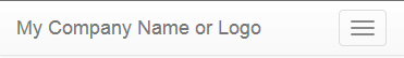
</nav>Code language: HTML, XML (xml)This would produce something like this, in expanded view:

And, this in the collapsed view (on smaller devices / viewports):
When using navbar-fixed-* classes, make sure you define padding in the body class, otherwise the navbar can clip the top/bottom of the page contents.
Notice that the search bar is declared first in the layout. This has been done because it ensures the search bar is at the top of the collapsed navbar menu on smaller screens. Technically speaking we could define the search bar within a form element which may help with layout and so it submits to the server when the enter key is hit, but in this case we want some validation so we’re forcing the user to click the search button and then calling onclick=”search()” instead.
Aside: regarding the search box enter scenario, we’d probably want the user to be able to hit the enter key while focus is on the search box and call the same in a production deployment. It is simple to do this by adding the following in the text-box definition:
onkeydown="var e = event || window.event; if (e.keyCode == 13) { search(); }"Code language: JavaScript (javascript)(The ‘event || window.event’ fragment is to get around event being undefined in some versions of IE.)
Navigation Menus – Breadcrumbs
A lot of web sites provide a breadcrumbs trail to allow the user to navigate back through the site structure more quickly. Fortunately, Bootstrap has this covered too.
<ol class="breadcrumb">
    <li><a href="#">Root</a></li>
    <li><a href="#">Main Topic</a></li>
    <li><a href="#">Sub-Topic</a></li>
    <li class="active">Current Page</li>
</ol>Code language: HTML, XML (xml)
Visibility Options
Visibility Options – Viewports
The visibility of elements based on media queries (relative screen size) can be performed quite easily using the visible-xs-*, visible-sm-*, visible-md-*, visible-lg-*, hidden-xs, hidden-sm, hidden-md and hidden-lg classes.
The visible-* set of classes displays content for that media size only (e.g. visible-xs-* only displays on screen widths smaller than 768px.) The hidden-* set of classes does the opposite – displaying in all cases EXCEPT the media size specified.
The visible-* set of classes should be used in conjunction with block, inline, inline-block suffices to create the overall class name (e.g. visible-md-block.) Bootstrap currently defines visible-xs, visible-sm, etc. (without the display style suffix) as well, but these have been deprecated and should be avoided.
Visibility Options – Printing
Bootstrap includes some classes for controlling what content is displayed on screens and what is printed. The classes concerned are:
- hidden-print – stops content from being displayed when the web page is printed.
- visible-print-block – print-only content that is structured as a block region on the page (equivalent to the display: block style.)
- visible-print-inline – print-only content that is displayed inline on the page (equivalent to the display: inline style.)
- visible-print-inline-block – print-only content that is structured as an inline-block region on the page (equivalent to the display: inline-block style.)
There is also a visible-print class with no display style suffix, but this has been deprecated and should not be used.
Panels
There are many occasions when you need to separate your content into regions. This can be done using the grid system alone, but you can often achieve better results with some decoration. Enter panels… These provide a way to logically structure your layout into boxes, optionally with headings and/or footnotes.
<div class="row">
    <div class="col-md-6">
        <div class="panel panel-success">
            <div class="panel-heading">Left-Hand Panel</div>
            <div class="panel-body">
                <br />Main content goes here.<br /><br /><br />
            </div>
            <div class="panel-footer">
                Supplementary content goes here in the footer.
            </div>
        </div>
    </div>
    <div class="col-md-6">
        <div class="panel panel-danger">
            <div class="panel-heading">Right-Hand Panel</div>
            <div class="panel-body">
                <br />Main content goes here.<br /><br /><br />
            </div>
            <div class="panel-footer">
                Supplementary content goes here in the footer.
            </div>
        </div>
    </div>
</div>Code language: HTML, XML (xml)
Panels can also be used with tables. This can be particularly useful if you want to provide a borderless table, but in a structured region of the page.
<div class="panel panel-default">
<div class="panel-heading">Panel heading</div>
<div class="panel-body">
<p>
Some (optional) content in the body of the panel
(possibly that describes the table.)
</p>
</div>
<table class="table">
<thead>
<tr>
<td>Username</td>
<td>Full Name</td>
<td>Last Login</td>
<td>Status</td>
<td>&amp;amp;nbsp;</td>
</tr>
</thead>
<tbody>
<tr>
<td>jsmith</td>
<td>John Smith</td>
<td>12 Sep 2016 12:34:56</td>
<td>Locked (Bad Passwd)</td>
<td><button type="button" class="btn btn-default">Unlock</button></td>
</tr>
<tr>
<td>jsmith2</td>
<td>Jane Smith</td>
<td>14 Sep 2016 17:54:32</td>
<td>Enabled</td>
<td><button type="button" class="btn btn-danger">Disable</button></td>
</tr>
<tr>
<td>jbloggs</td>
<td>Joseph Bloggs</td>
<td>14 Sep 2016 15:11:22</td>
<td>Enabled</td>
<td><button type="button" class="btn btn-danger">Disable</button></td>
</tr>
<tr>
<td>gsmeloons</td>
<td>Gloria Smeloons</td>
<td>28 Jan 2012 12:58:02</td>
<td>Disabled</td>
<td><button type="button" class="btn btn-success">Enable</button></td>
</tr>
</tbody>
</table>
</div>Code language: HTML, XML (xml)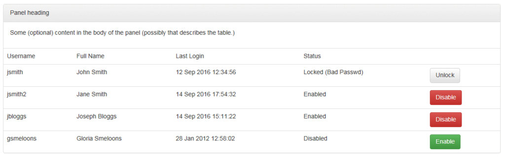
Buttons, Badges, Labels and Alerts
These are all being covered together because of similar functionality/style of use. Buttons are probably an exception but are being included here for convenience.
For each of the elements being described there are variants for ‘default’, ‘primary’, ‘info’, ‘warning’, ‘danger’ and ‘success’.
Buttons/Badges/Labels/Alerts – Buttons (and Badges)
Buttons are, fairly obviously, clickable blocks within a web page that perform some action.
Badges are notification areas within a larger block region that displays information.
Buttons are defined as normal HTML elements with the appropriate Bootstrap classes, and Badges can be used with them if desired.
<button class="btn btn-info" type="button">
    News <span class="badge">7</span>
</button>Code language: HTML, XML (xml)
Badges can actually be used anywhere, but take care to ensure there is some padding so the layout looks right.
Buttons can be configured into button groups that appear as a set of clickable regions in a rounded container. To take advantage of this, simply wrap the buttons in a div with the btn-group class. In the first button group in the example below, the layout will take up only as much room as the button label and padding, etc. requires. In the second button group, the btn-group-justified style has been added to stretch the layout to the full width of the parent element.
<div class="btn-group">
    <button type="button" class="btn btn-default">First</button>
    <button type="button" class="btn btn-warning">Second</button>
    <button type="button" class="btn btn-danger">Third</button>
</div>
<div class="btn-group btn-group-justified">
    <button type="button" class="btn btn-default">First</button>
    <button type="button" class="btn btn-warning">Second</button>
    <button type="button" class="btn btn-danger">Third</button>
</div>Code language: HTML, XML (xml)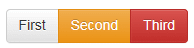
Buttons can also be configured with drop-down menus. This can be either as a button that displays a drop-down, or a button with default behaviour and a separate caret for additional menu options. Examples for each of these are provided below.
<div class="btn-group">
    <button type="button" class="btn btn-default dropdown-toggle"
        data-toggle="dropdown" aria-haspopup="true" aria-expanded="false">
        About Us<span class="caret"></span>
    </button>
    <ul class="dropdown-menu">
        <li><a href="#">About The Company</a></li>
        <li><a href="#">Contact Us</a></li>
        <li role="separator" class="divider"></li>
        <li><a href="#">Careers</a></li>
    </ul>
</div>

<div class="btn-group">
    <button type="button" class="btn btn-info">About Us</button>
    <button type="button" class="btn btn-info dropdown-toggle"
        data-toggle="dropdown" aria-haspopup="true" aria-expanded="false">
        <span class="caret"></span>
    </button>
    <ul class="dropdown-menu">
        <li><a href="#">About The Company</a></li>
        <li><a href="#">Contact Us</a></li>
        <li role="separator" class="divider"></li>
        <li><a href="#">Careers</a></li>
    </ul>
</div>Code language: HTML, XML (xml)
These HTML fragments produce the following buttons, respectively:
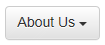
In the first case, clicking the button will simply display the drop-down menu. In the second case, clicking the caret will display the drop-down menu but clicking the button itself will launch an action (such as redirecting the user to the ‘About The Company’ page in this case.)
Buttons/Badges/Labels/Alerts – Labels and Alerts
Labels are decorated blocks of text, that can draw user attention. They should generally be used to further annotate a title, sentence, etc. and not as a form of significant alert (since there are separate classes for that.)
<div>
    Spicy Tomato Flavour <span class="label label-primary">New</span>
</div>Code language: HTML, XML (xml)
Alerts are similar in style to labels but are fully justified across the width of the parent element and will have additional padding (by default) to emphasize the alert.
<div class="alert alert-success text-center">
    It worked!
</div>Code language: HTML, XML (xml)
Miscellaneous Other CSS Elements
Misc CSS – List Groups
List groups provide a simple way to group a collection of items into a bordered region.
<ul class="list-group">
    <li class="list-group-item">Recipes <span class="badge">6 New</span></li>
    <li class="list-group-item">Ingredients</li>
    <li class="list-group-item">Utensils</li>
</ul>

OR

<div class="list-group">
    <button type="button" class="list-group-item">First Option</button>
    <button type="button" class="list-group-item">Second Option</button>
    <button type="button" class="list-group-item">Third Option</button>
</div>Code language: HTML, XML (xml)
Misc CSS – Glyphs
Bootstrap includes a predefined set of standard icons for many tasks and notifications. Using these is a simple matter of referencing the appropriate classes in an element. For example, we can specify them in a span, as part of an input-group, etc.
<span class="glyphicon glyphicon-cog"></span>
<br />
<div class="input-group">
    <input type="text" class="form-control" placeholder="Search" />
    <button type="button" class="btn btn-success input-group-addon">
        <span class="glyphicon glyphicon-search"></span>
    </button>
</div>Code language: HTML, XML (xml)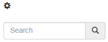
Misc CSS – Progress bars
There are plenty of times when your web page is going to be busy doing something (e.g. posting back to the server asynchronously.) If it is going to take a while to refresh the view, it doesn’t hurt to display some progress indication wherever possible. Bootstrap provides a set of progress bar classes to achieve this, although some of the gradient and other effects don’t work on earlier versions of web browsers (because they use CSS3 definitions that the older browsers may not support.)
<div class="progress">
    <div class="progress-bar progress-bar-success" role="progressbar"
        aria-valuenow="80" aria-valuemin="0" aria-valuemax="100"
        style="width: 80%; min-width: 4em;">
        80%
    </div>
</div>Code language: HTML, XML (xml)
The default progress bar colour is blue, so we’ve specified the progress-bar-success class to make it green instead. Also, notice that the bar’s progress is set within a style attribute of the div element. You may also have noticed there’s a min-width value specified here – this is useful to ensure the text in the progress bar (if being used) is always displayed such that the user can read it. In this case the progress text is the percentage so we know it’ll be a maximum of 4 characters.
The progress bar can be made stripy by adding the progress-bar-striped class (uses CSS3 animations and transitions) and can be made animated by adding the active class too. For example:
<div class="progress">
    <div class="progress-bar progress-bar-success progress-bar-striped active" ... >
    </div>
</div>Code language: HTML, XML (xml)
Misc CSS – Pagination
Paging controls can be rendered using the pagination classes. Pagination elements should always be wrapped in a nav element.
<nav aria-label="results paginator">
<ul class="pagination">
<li>
<a href="#" aria-label="Back">
<span aria-hidden="true">&amp;laquo;</span>
</a>
</li>
<li><a href="#">6</a></li>
<li><a href="#">7</a></li>
<li><a href="#">8</a></li>
<li><a href="#">9</a></li>
<li><a href="#">10</a></li>
<li>
<a href="#" aria-label="Next">
<span aria-hidden="true">&amp;raquo;</span>
</a>
</li>
</ul>
</nav>Code language: HTML, XML (xml)
You can specify a relative size for the pagination elements using the pagination-sm, pagination-lg, etc. classes.
Bootstrap also provides a more simple paging option using the pager class.
<nav aria-label="form pager">
    <ul class="pager">
        <li><a href="#">Back</a></li>
        <li><a href="#">Next</a></li>
    </ul>
</nav>Code language: HTML, XML (xml)
If required, the pager buttons can be assigned to the left and right sides by decorating the list item (li) element with either the previous or next class name.
<nav aria-label="form pager">
    <ul class="pager">
        <li class="previous"><a href="#">Back</a></li>
        <li class="next"><a href="#">Next</a></li>
    </ul>
</nav>Code language: HTML, XML (xml)
Misc CSS – Wells
Wells provide an inset look to a region of the page. This can be useful to split the sections out logically, or to draw attention to a particular region of the page.
<div class="well well-lg">
    Some text in an inset panel.
</div>Code language: HTML, XML (xml)
Misc CSS – Screen-Reader Only Content
Bootstrap promotes use of ARIA attributes for accessibility, but defines a few additional classes for accessibility too. The sr-only and sr-only-focusable classes allow your web page to offer an improved experience for users with sight issues that need to use screen readers.
It is recommended that you provide the option for screen-reader based users to skip to the main page content if your web page layout includes a large header region (or navigation bar) or if there is a large amount of any other HTML at the beginning of the document that detracts from the content.
<a href="#MainContent" class="sr-only sr-only-focusable">Jump to main content</a>
<div>
    <!-- loads of header region or navigation bar definitions the
        screen reader can skip. -->
</div>
<a name="MainContent"></a>
<div>
    <!-- the page content the user is likely to be more interested in! -->
</div>Code language: HTML, XML (xml)
Screen reader content can be added anywhere it will be useful. For example, it could be added to a collapsed navbar layout to aid navigation.
<nav class="navbar navbar-default">
    <div class="container-fluid">
        <div class="navbar-header">
            <button type="button" class="navbar-toggle collapsed" ... >
                <span class="sr-only">Toggle navigation</span>
                <span class="icon-bar"></span>
                <span class="icon-bar"></span>
                <span class="icon-bar"></span>
            </button>
            <a class="navbar-brand" href="#">Company Logo</a>
        </div>
    </div>
</div>Code language: HTML, XML (xml)Modal Popups
Bootstrap provides JavaScript functions to support the display of in-page modal popups. The modal features are included in the bootstrap.js (or minified bootstrap.min.js) file, or can be added individually via Bootstrap’s modal.js file.
The modal itself is defined as normal HTML, using the appropriate CSS classes to style it. Display of the modal is then controlled via JavaScript function calls.
<div id="myModal" class="modal fade text-center" role="dialog"
aria-labelledby="myModalTitle">
<div class="modal-dialog" role="document">
<div class="modal-content">
<div class="modal-header text-left">
<button type="button" class="close" data-dismiss="modal"
aria-label="Close">
<span aria-hidden="true">&amp;times;</span>
</button>
<h4 id="myModalTitle" class="modal-title">Modal Title</h4>
</div>
<div class="modal-body text-left">
<div class="row">
<div class="col-md-12">
Are you sure you want to discard any unsaved changes?
</div>
</div>
</div>
<div class="modal-footer">
<button type="button" class="btn btn-success"
data-dismiss="modal">
Yes
</button>
<button type="button" class="btn btn-danger"
data-dismiss="modal">
No
</button>
</div>
</div>
</div>
</div>
<button type="button" class="btn btn-default" data-toggle="modal"
data-target="#myModal">
Show Modal (1st Option)
</button>
<button type="button" class="btn btn-default" onclick="$('#myModal').modal();">
Show Modal (2nd Option)
</button>Code language: HTML, XML (xml)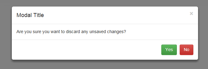
Notice that two different approaches to displaying the modal have been provided in the example. The first one uses data-* attributes applied to the button element to identify the behaviour of the button (to display a modal pop-up.) In the second button syntax, JavaScript is defined in the onclick event handler. The first option is easier to read if your modal is going to be launched only by a button or other static page element, but the second option is more flexible as it can be used as described, or within other JavaScript functions, etc.
Also, note that the data-dismiss attribute is used in various places to hide the modal popup again. This is the easiest approach if all you want to do is close the dialogue box, but if you want to do something more significant (such as roll back changes, post content to the server, etc.) then you can do so with inline JavaScript syntax or a call to a JavaScript function, as described below.
<div class="modal ...">
    <!-- header and body definitions omitted for brevity. -->
    <div class="modal-footer">
        <button type="button" class="btn btn-success" onclick="doStuff()">Yes</button>
        <button type="button" class="btn btn-danger" data-dismiss="modal">No</button>
    </div>
</div>
<script type="text/javascript">
    function doStuff() {
        $('#myModal').modal('hide');
        // Stuff that needs to be done.
    }
</script>Code language: HTML, XML (xml)
By default, the modal popup will close if the user clicks anywhere in the backdrop region behind the dialogue box. To stop this you can add arguments to the modal() method call like this…
$('#myModal').modal({ backdrop: 'static', keyboard: false, show: true });Code language: JavaScript (javascript)Using the ‘static’ option for backdrop stops the user from being able to dismiss the dialogue box by accident if they click the background region. This may be desired in some cases, and undesirable in others depending on the situation.
Also notice that we’ve specified ‘keyboard: false’. This stops the user from being able to dismiss the dialogue box by hitting the Escape key on the keyboard.
The backdrop and keyboard options can also be passed as data-* attributes like this:
<div id="myModal" class="modal fade text-center" role="dialog"
    aria-labelledby="myModalTitle" data-backdrop="static" data-keyboard="false">
    <!-- modal layout omitted for brevity -->
</div>Code language: HTML, XML (xml)Tabbed Layouts
NOTE: Nesting of tabbed layouts is not supported.
As with modal popups, the tabbed layout behaviours rely on JavaScript functions to support their display. The tab features are included in the bootstrap.js (or minified bootstrap.min.js) file, or can be added individually via Bootstrap’s tab.js file.
The tab layout is defined using CSS classes in HTML.
<div class="well">
    <ul id="MyTabs" class="nav nav-tabs" role="tablist">
        <li class="active" role="presentation">
            <a id="HomeTab" href="#HomeTabContent" aria-controls="HomeTabContent"
                role="tab" data-toggle="tab">
                Home
            </a>
        </li>
        <li role="presentation">
            <a id="ProductsTab" href="#ProductsTabContent"
                aria-controls="ProductsTabContent" role="tab"
                data-toggle="tab">
                Products
            </a>
        </li>
        <li role="presentation">
            <a id="ServicesTab" href="#ServicesTabContent"
                aria-controls="ServicesTabContent" role="tab"
                data-toggle="tab">
                Services
            </a>
        </li>
        <li role="presentation">
            <a id="AboutTab" href="#AboutTabContent" aria-controls="AboutTabContent"
                role="tab" data-toggle="tab">
                About Us
            </a>
        </li>
    </ul>
    <div class="tab-content">
        <div id="HomeTabContent" class="tab-pane active" role="tabpanel">
            stuff on the home tab
        </div>
        <div id="ProductsTabContent" class="tab-pane" role="tabpanel">
            stuff on the products tab
        </div>
        <div id="ServicesTabContent" class="tab-pane" role="tabpanel">
            stuff on the services tab
        </div>
        <div id="AboutTabContent" class="tab-pane" role="tabpanel">
            stuff on the about the company tab
        </div>
    </div>
</div>Code language: HTML, XML (xml)
ou can specify nav-pills instead of nav-tabs in the unordered list to have pill-style tab headers instead of the usual tabs if you want. The data-toggle=”tab” attribute on the anchor tag allows for switching to a tab pane without any JavaScript being required. If you need to display a particular pane programmatically you can do this too:
// Various ways to display a tab

//By tab element's ID
$('#ServicesTab').tab('show');

// By tab's anchor element's href value
$('#MyTabs a[href="#ProductsTabContent"]').tab('show');

// Select the first tab in the collection
$('#MyTabs a:first').tab('show');

// Select the last tab in the collection
$('#MyTabs a:last').tab('show');

// Select the 2nd tab in the collection (0-based index)
$('#MyTabs li:eq(1) a').tab('show');Code language: JavaScript (javascript)
Notice that the tab content containers (divs) need to have explicit IDs to make switching between tabs possible. Although, strictly speaking, the tabs (the list items) themselves don’t need to have explicit IDs, it is useful to define them too, to make programmatic selection of tabs easier – as demonstrated in the code fragment above it can be done via the anchor tag’s href attribute if necessary but this isn’t ideal.
You can also attach tab behaviour programmatically, like this:
$('#MyTabs a').click(function (e) {
    e.preventDefault()
    $(this).tab('show')
});Code language: JavaScript (javascript)Scroll-Spy
The scroll-spy works with navs and can highlight the menu item in the nav that corresponds to the current point in the page being viewed. This is especially useful where the web page is long with several sub-titled sections, for example.
The feature has some specific requirements such as the target having a nav element, the layout positioning being relative (position: relative). Normally the feature will be spying on the body element of the page. If not then make sure the tag being spyed on has a height set and overflow-y: scroll; applied.
You can configure a scroll-spy declaratively…
<body data-spy="scroll" data-target="#SideNav">
    <div id="SideNavHost" data-spy="affix" data-offset-top="100"
        data-offset-bottom="100">
        <nav id="SideNav">
            <ul class="nav nav-pills nav-stacked">
                <li role="presentation"><a href="#FirstSection">Topic 1</a></li>
                <li role="presentation"><a href="#SecondSection">Topic 2</a></li>
                <li role="presentation"><a href="#ThirdSection">Topic 3</a></li>
                <li role="presentation"><a href="#FourthSection">Topic 4</a></li>
            </ul>
        </nav>
    </div>
<!-- page body omitted for brevity -->
</body>Code language: HTML, XML (xml)
The Scroll-spy can also be attached to a nav element programmatically, like this:
$('body').scrollspy({ target: '#SideNav' });Code language: JavaScript (javascript)You may notice the data-spy=”affix” attribute in the parent div of the navigation control being targeted. This is another Bootstrap JavaScript feature that anchors an element to a position on the page in view. When the user scrolls up and down, the element’s position is updated to keep it visible. The affix feature can also be set programmatically, like this:
$('#SideNavHost).affix({ offset: { top: 100, bottom: 100 }});Code language: JavaScript (javascript)